
We all see colour grading everywhere, every single day, so much so that our eyes barely even notice it. Everything is hyper-saturated, hyper-perfected, and hyper-real. But how do we scratch beneath the superficial surface of colour correction?
These days, everyone with a smartphone has the ability to colour grade an image with the quick swipe of an Instagram filter. They’ve become so ingrained in our daily media absorption that our eyes can almost pinpoint which preset has been applied to a given picture. But the real art of colour grading comes sooner – when you look through the barrel of the lens and know that the flat, unedited, ungraded image will get the finished look you’re after.
But why is it important for your business?
Colour grading isn’t just for a pretty aesthetic. It is emotive, it tells your story the way you want audiences to see it, and most of all – it gives brand continuity. You’ve got a photographer shooting your outdoor campaign, a digital designer working up your online assets, and a videographer splicing together the motion. Lots of cooks, lots of ingredients, but one big dish that needs to blend perfectly. And this is exactly why I count myself incredibly lucky that I work in a fully-integrated Agency. Every campaign is overseen by a team and every creative execution is on-brand.
Here is an example from our recent Department for the Economy Apprenticeships TV advert:
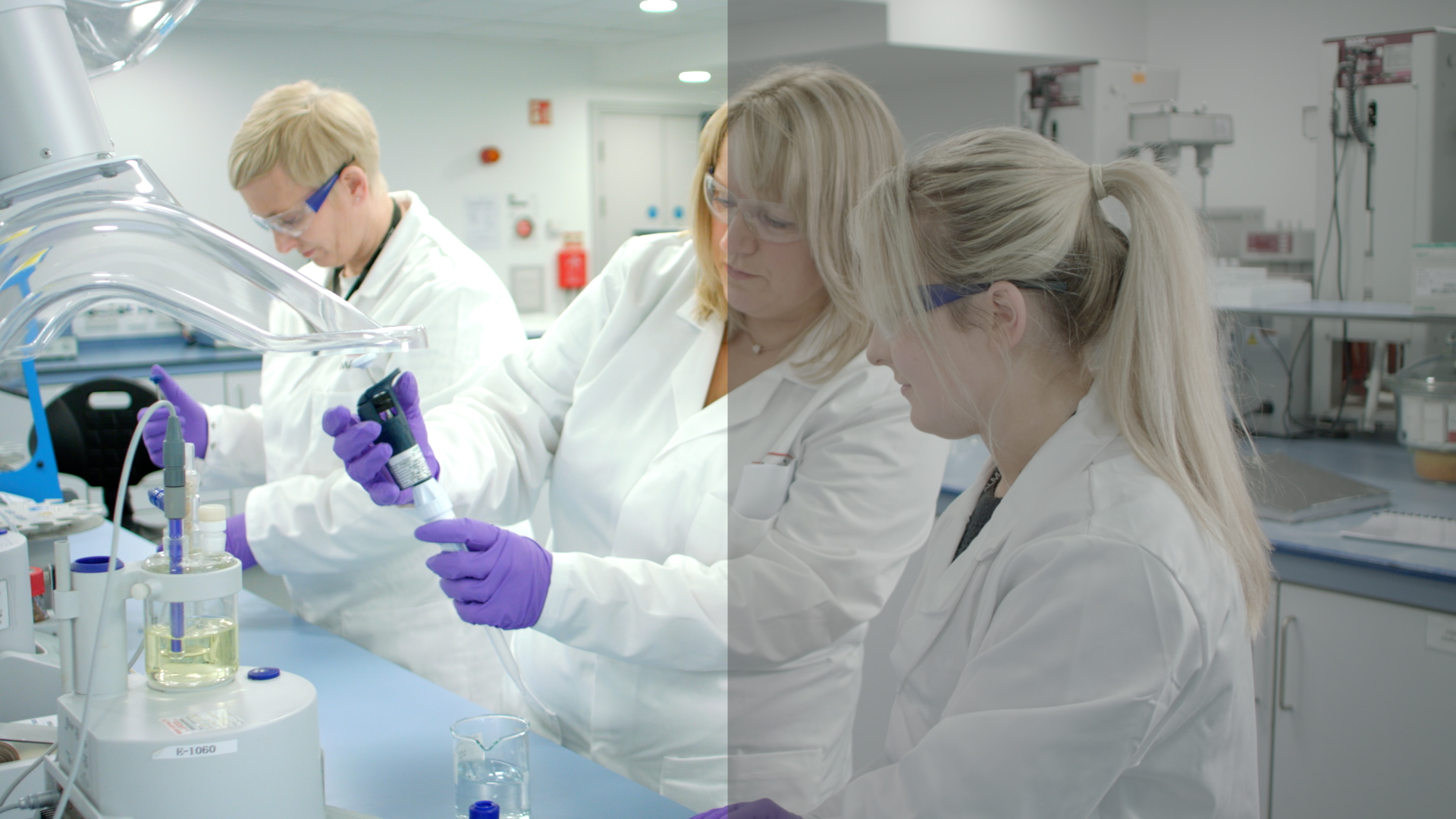
From changes in saturation to enhance skin-tone and vibrancy, to creating contrast which separates the people from the background, you can see for yourself how much of an impact colour grading has on a creative campaign. And for brand continuity, here’s how it looks on a billboard:

So if your brand is ready to get creative in the videography suite, we’re always here for a chat, so get in touch and let’s make movie magic together. Check out the Skills to Succeed Apprenticeships video below: