
Have you heard the term User Experience used before but are unsure of how this relates to your website?
“Only 55% of companies are currently conducting any user experience testing.”
This means now could be the time to take your websites User Experience seriously and rise above your competition.
Source: truelist.co
Better User Experience means more satisfied users and higher conversion rates. Below are 5 ways to improve the UX of your website or products and in turn provide the customer with a meaningful and rewarding experience:
1. Know your user
It is important to understand who your users are and how they interact with your product or website. Without an understanding of the user, you will never be able to provide a truly tailored experience.
Getting to know your user means understanding their needs, expectations and objectives when interacting with your product. This information can be gathered through qualitative research methods like focus groups, usability testing and customer feedback.
For example, if the majority of your users are 65+, the interface needs to be simple enough to navigate. Another scenario might be that users are accessing the site when travelling; therefore, your mobile offering needs to be fully responsive and stack in a logical order.
Having an understand of these challenges allows for creative solutions which ensure the experience is intuitive and rewarding.
2. Structure your content
“Information Architecture (IA) is a science of organising and structuring content of the websites, web and mobile applications, and social media software.”
Source: uxplanet.org
Getting the structure of a website and its contents correct is key, as this is the skeleton upon which a user will navigate the site. Successful websites are always well structured, allowing the user to find what they are looking for, even when they boast thousands of products or pages.
Categorising content allows for grouping of similar pages, services or products in one area. This is usually done within a menu that then has dropdown navigation, which allows the user to filter down to the key information, functionality or product they are looking for.
A great way to start thinking about site structure is by card sorting. This involves writing out all key pages onto cards or post-it notes. Next, sort the cards into similar groups and label each group with an overarching name that best describes it. For example, if the group included items such as Monitors, Laptops and USB Hubs, then this could be categorised as Computers & Accessories.
Start with post-it notes to mke the planning process more flexible:

Once you are happy with your intended structure, draw up a sitemap as a point of reference and keep it up-to-date as new pages and sections are added:
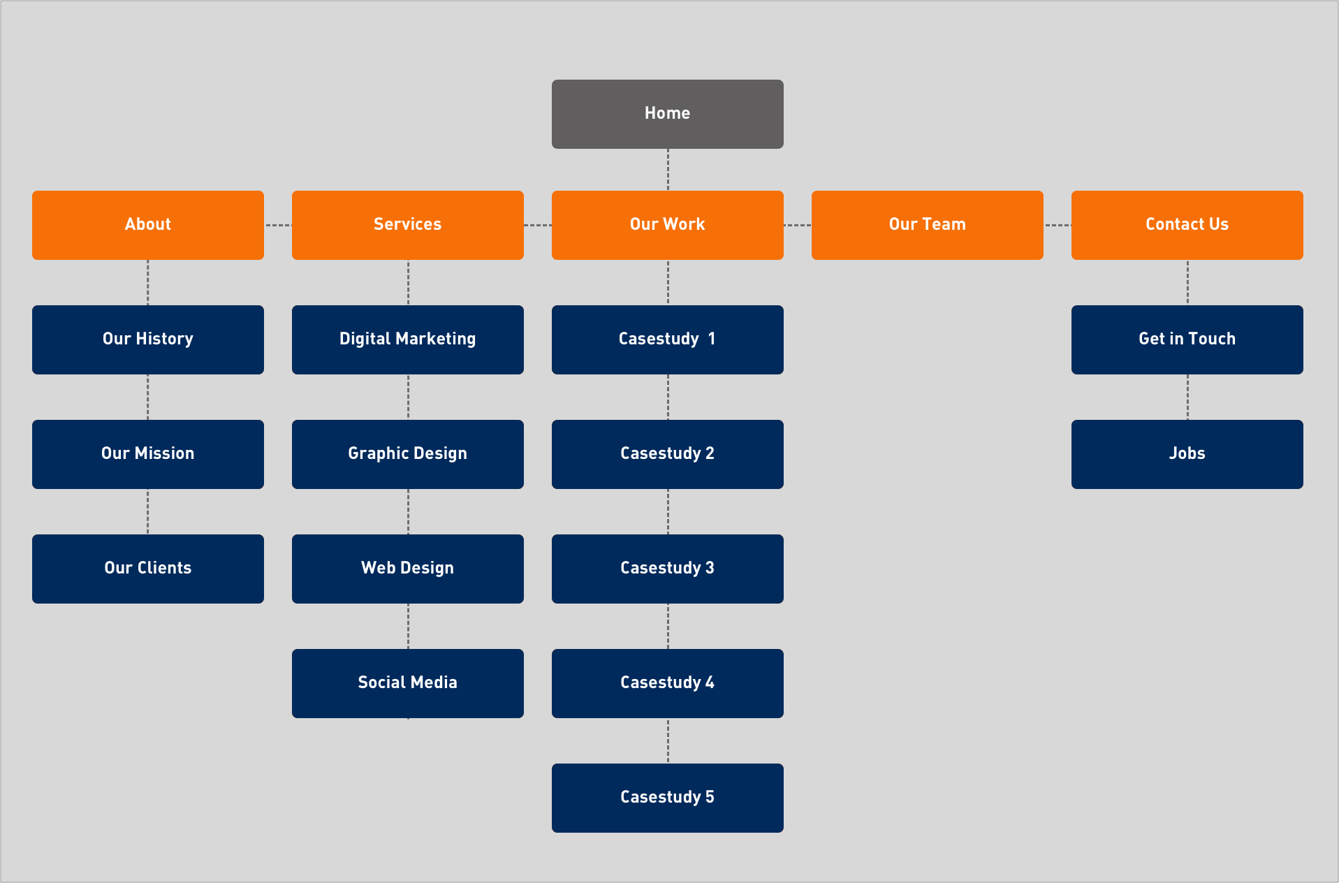
ING Bank is a great advocate of categorising content. ING utilised card sorting and tree testing, to reorder and regroup key product journeys.
“Now, only 0.7% of app users call the call centre to complete their task, and this number continues to fall over time.”
Source: User zoom
A solid site structure improves overall UX while reducing bounce rate (the number of single page interactions) and making key information accessible through a clear structure.
3. Responsive design
It is now more important than ever to have a responsive website. This means that your website not only displays correctly on desktop, but also on other devices such as mobiles and tablets. Most importantly, a responsive site can scale up or down depending on the screen size while still being consistent in style and information presented.
“74% of people are likely to return to a website if it is optimised for mobile.”
Source: Truelist.co
Having a consistent experience across all devices gives the user a sense of familiarity and comfort. This is because they can successfully navigate your site or product regardless of the devices they are using.
4. Provide feedback to the user
Providing feedback to the user is key in establishing an understanding between them and your site/product. User feedback can come in many forms: a simple example would be an “Added to Basket” message, letting the user know the item they have selected is now in their basket.
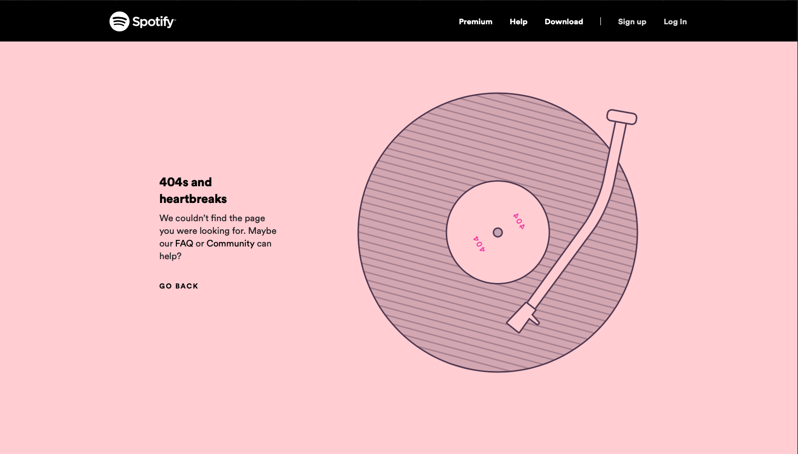
User feedback helps to reduce uncertainty and provide users with responses to their actions. Using a 404 page as an example where a user may click on a link that is expired or invalid, there are essential two potential outcomes:
- They land on a blank page that says “error” (which looks very different from your site), following which they may just give up and leave the website completely.
- They land on a 404 page that explains the page doesn’t exists but offers links to other pages on the site, meaning they are more likely to continue back to your site. Furthermore, a 404 page can be great to reinforce your brand by using creative ideas and design. This would otherwise be a bad experience, but now the user has an explanation along with a page consistent with the rest of the site.
User feedback is especially important where the user is making a purchase. Nothing is worse than submitting a card payment online only to be greeted with a blank page, unsure if money has left your account. Instead, providing a “Thank you for your purchase” message along with an estimated delivery date and tracking link fills the user with much more hope. It is these small things that help to build a good reputation and attract repeat customers.
Spotify's 404 page:
5. Take advantage of user data & analytics
Using data gathered from a site or product via analytics is invaluable to helping find low performing areas of a site. It can also be a great tool to help measure the success of site improvements once they have been implemented.
Google Analytics can be used to gather information on your website’s users, picking up information like bounce rate, demographics, devices, traffic sources etc. This allows for a better understanding of where the users are coming from and how they are interacting with your site. Additionally, it allows to identify problem areas and create informed solutions.
Another popular method is called A/B Testing which involves showing two sets of users slightly different pages and measuring the conversions of these pages.
For example, you could have two landing pages, each with slightly different text. If one page resulted in more clicks of the CTA button or more enquires than the other, you would then use this as your base before trying to change any other elements of the page.
Continually building on data like this allows you to ensure you are using the best language/designs/structure to engage with your audience.
Could your company benefit from increased website engagement and conversion rates? E-mail us today at info@ardmore.co.uk to see how we can provide spectacular UX results for you and your business.